akari – Josef Müller Brockmann

This poster, originally designed in 1975 by Josef Müller Brockmann was designed for a Lamp Exhibit to be displayed at Kunstgewerbemuseum, a Museum of Decorative Arts in Germany. The poster is meant to advertise the exhibit to the public and grow interest, like most posters. Using striking simple shapes and tightly packed word clusters on a grid it is designed to be a unique and artistic interpretation of the Art Exhibit.

The poster’s focal point can be described as a large geometric circle made up of seven rows of lines of the same width, but the colour of the circle is chosen to create the illusion that it is illuminated. By putting the more saturated, lower value colours on the outside edges of the circle and the desaturated, high value ring of colour at the centre it strongly resembles the effect of looking at most man made light sources and creates a strong glow effect. Below the shape is the main type cluster which features the title of the event, the location, date & time the exhibit will be open and the names of each exhibit.

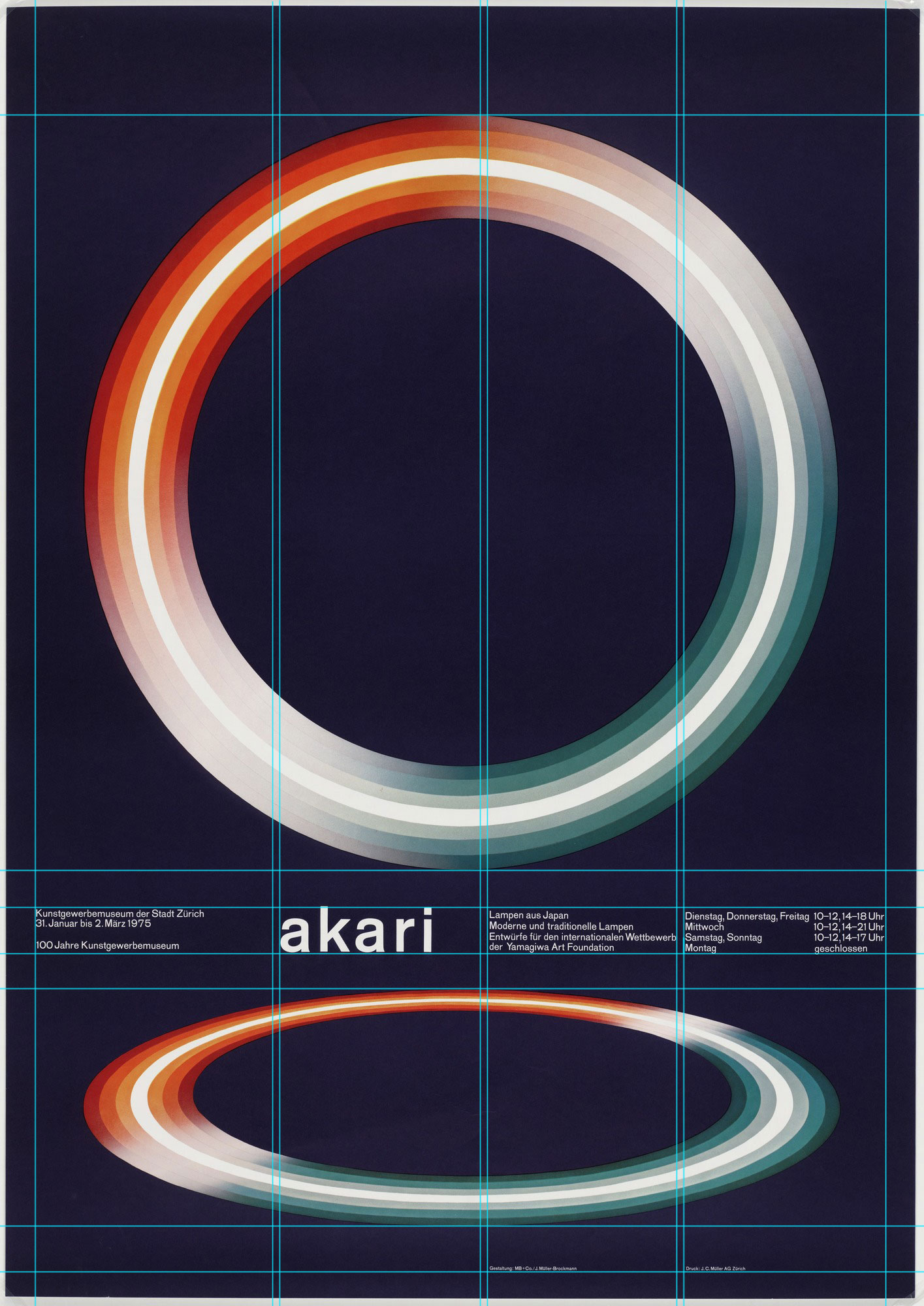
A few typographic & layout rules that this poster follows well that I can note are it’s use of composition, grids, colour & hierarchy. The poster is well balanced despite it’s asymmetrical layout, it uses the rule of thirds on the vertical axis of the poster to position the main line of text, as well the title is positioned by the rule of thirds horizontally so that it stand out, but also along the horizontal axis the text is split into a four column grid to create a uniform shape and space with the text. Spacing between each element in the grid is also equalized to create balance; between text and between shapes there is an equal amount of space as can be seen in this gridded dissection of the poster. The poster features a simple colour scheme using two complimentary colours with red and blue. Finally the text does feature a limited level of hierarchy by making the text of the title larger, letting it stand out.

A lot of the aesthetic choices of this poster were chosen despite breaking some general rules of typography, and for that reason I quite like it. When rules are broken to emphasize and strengthen a certain style that the designer intended to go for I feel it always makes for a unique and striking design. A few rules I can note being broken in this particular design are it’s sole dependance on reversed type, which understandably is more difficult to read than dark text on a light background, though I think it works very well on this poster. While not a sin in itself, Brockmann has a uniquely simplified approach to text hierarchy; there are only two levels of text despite the large amount of different information. I feel this simplified approach to hierarchy is very effective for such a simple layout as each text cluster fits the same height on four lines.

I think something that I definitely can take from this poster is that there can be a lot going on even for the most simple and minimalistic designs. Some of the most memorable posters and designs for me personally are those that are quite minimalistic but understanding why they were effective has made me appreciate their subtle use of design principles and how even the most simple looking design has a lot of underlying structure.

Using Type Successfully as an Artistic Element on the Web

awwwards best typography examples

Typography and Web are two mediums that have only been blended together quite recently in history and it’s just now that I feel that we’re starting to see the full potential of this partnership. When browsing the web and creating websites of my own I am always drawn to websites that push the boundaries of type in creative and unique ways. The boundaries and guidelines set by design committees that 90% of the internet follow have created a more legible and functional internet but that’s not what interests me, type is an art form like any other and web design is just a new canvas for that art to flourish. In this blog I want to highlight creative use of typography in web design and focus on how websites use design fundamentals & the unique potential of web to create such stunning layouts.

The design practices which I will focus on with today’s article will be principles & methodology mentioned in posts by the three previous blogs I discussed in my last article (webflow, the futur, typographica).


Composition
the futur

Composition is the foundation of design and it is here where we make decisions that change the look of a design most drastically. A key part of all composition I’ve learned is Contrast. Maintaining good contrast is one— if not the most important rule to follow. Contrast is the most effective tool we have as designers in guiding the eyes of the viewers that will see our designs.

“If you ever find yourself stuck with a boring composition, push the contrast in the value, weight, size, and color of your subjects.”

This sentiment is shared in the futur’s blog post written by Matthew Encina which expands upon the many aspects of contrast in use and how it can entirely change the meaning of a subject in our designs.


Following Trends
Webflow

Something that not every designer is a fan of is following trends, as designers we always want to be unique and create designs no-one has ever seen before, but that’s rather difficult without inspiration; and that’s where trends come in. By reading posts such as this one by webflow that highlight the newest trends or even trends from the past we can see how other designers think and use their ideas as inspiration to craft and execute our own unique typographic designs.


Font Pairing & Treatment
Typographica & Webflow

Another extremely important consideration when designing any webpage; just like print, is choosing an effective pairing of fonts to fit your design. When choosing individual fonts there are many considerations to be made already. Considerations include things such as: tone, legibility & readability, however when pairing fonts together other considerations must be made. The tone can change tremendously when you look at two fonts together, also one must consider which font to use for headings and which to use for body copy.

Most of this logic is shared between print and web but some considerations that are unique for web design include: variations in size on different devices, the possibility of using animated text, using text with live updating data. Of course with this new layer of creative freedom come some difficulties that designers need to be aware of, because despite having access to thousands of fonts for print, not all fonts are treated equally on the web, as they need to be rendered by different web browsers and read on screens instead of paper.

Webflow has an excellent blog on the basics of web typography and Typographica has a short podcast that takes a deeper look at the process of selecting font pairings.


Theres certainly more to design than the three points I touched on here, but if theres anything that I think you should take from this blog; it is that designers always need to push the boundaries, whether it be their own comfort zones with type or turning a design fundamental on it’s head to create something incredible and different. There’s always more we can discover is possible with web type as this is a genre that has only just begun. And with that, these were some key points I found that I believe are fundamental for any future web designer looking to step up their use of typography when designing websites.

Three Design Blogs That You Should Definitely Read Instead of This One

It’s very rare that I ever find myself reading a blog post these days. I’m always interested in learning and seeking out new information, especially in regards to the creative field. But blogs are often the least likely source I’ll ended up seeking that knowledge from.

I’m more likely to seek out info from my favourite design books to refresh on concepts and practices, or watch an educational video from a designer/ firm I like on subjects that are new and interesting to me. But it’s very rare that I find a great blog about a design.

The main problem I found; anyone could write a blog, but not everyone was as insightful as others. And with such a large amount of people suddenly able to post their own blogs on the same subject, it makes it rather difficult to find a blog that stands out and offers a comprehensive look into a subject.

And yet, there are rare occasions I find a wealth of knowledge like these three blogs I do think you should read. These blogs belong to designers, developers & educators I came to discover first through other sources and only then did I learn that they had preserved their knowledge and insight in the form of blogs as well. These blogs offer a huge variety of depth in their focus, from the miniscule shape characteristics of a typeface to the larger picture of planning an entire creative project, I think these blogs actually have something that you as a fellow designer may actually find useful.

So without further ado I present to you; three blogs you probably should read instead of this one:

medium.com/the futur

The Business of Design & Design Perspective

The futur is the place you go when you want to learn about the business of design. Not only just how to make designs look pretty, but how to market, brand, & sell your expertise & how to focus on the bigger picture.

The futur is a large scale learning resource created by Chris Do of Blind, a design firm in L.A. and along with a large amount of free information and teaching, the futur also offers courses focusing in specific skills & fields to help designers develop in their respective profession. While they do have a very remarkable blog I think their strongest educational tool is their youtube channel, and it would be criminal of me not to mention it as well.

Webflow.com/blog

Design Trends & Design Practices

Webflow is an online responsive web design tool I discovered a few years ago and has changed how I work as a designer and sped up my process drastically. And while they are a business first they also have an awesome amount of community content curated for creators. With both a YouTube channel and a blog, webflow mainly focuses on new design trends as well as reinforcing good design practices for web projects, also their videos are strongly centered on tutorials for their own platform as it can be used as a great design tool.

Typographica.org

A Blog About All Things Type

Typographica is an oldie but a goodie. Originally founded in 2002, this blog focuses heavily on type and the usage of type in the world today. With a large directory of typeface reviews and dissections, recommendations to books and highlighting hundreds of designers. Typographica is an excellent resource for anyone looking to delve into the world of type.


Those are my top three design & typography blogs. They cover a wide range of design sensibilities; from the broadest picture of strategy, to the smallest of typeface choices, I personally feel these blogs are fundamental to any designer looking to increase their skills. I hope you find these blogs as insightful as I have, and discover what other resources they offer beyond just their blogs.